|
|
 |
|
|

 With the advances in new media and the explosion of the Internet and eCommerce it has never been more important for your fonts to perform well on-screen. Your corporate fonts may look fine on the printed page but how well do they stand up in Powerpoint presentations or at text sizes on your secretary's monitor? With the advances in new media and the explosion of the Internet and eCommerce it has never been more important for your fonts to perform well on-screen. Your corporate fonts may look fine on the printed page but how well do they stand up in Powerpoint presentations or at text sizes on your secretary's monitor?
Unless your font has been optimized, or 'hinted', to a high standard your staff may have good reason to complain; wordprocessing or typesetting becomes particularly tiring on the eyes and is considered as a high priority issue by Health & Safety Executives across Europe. On a practical level the appearance of your work, the quality of your corporate image and the clarity of your intended message can only benefit from the use of sharp, high quality type.
So what does 'hinting' mean? For those of you interested in the technical breakdown we recommend that you refer to the Microsoft white paper on their website , but in basic English a 'hinted' font is one which has been enhanced, literally pixel by pixel, to produce legible, finely tuned characters on-screen. TrueType technology lends itself most easily to hinting improvements and well hinted TrueType fonts are the best choice if you're using type on low resolution monitors, especially at sizes under 14 point.
We are regularly commissioned to enhance fonts for on-screen use. Contact us to learn how your corporate fonts could be given a whole new lease of life. See Also: Corporate Font Solutions.
|
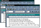
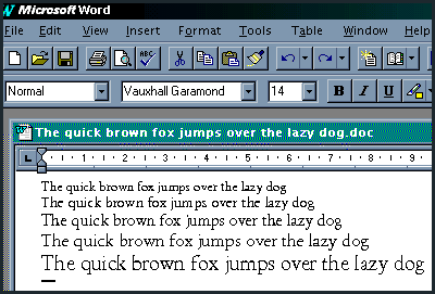
The 'before and after' samples below illustrate quite clearly the differences between standard and well hinted TrueType fonts on screen at smaller sizes and the enhancements that can be made. The text in these samples was set in Vauxhall's hinted Garamond Regular 9-14 point in MS Word.
Unhinted Sample
Allowing for the fact that the font is a serif style and hence less conducive to screen use at these sizes, the standard font nevertheless displays the typical traits of an unhinted typeface. Note the irregular stems, inconsistent overall weight and the bowls of letters 'e' & 'a' filling in. Alignment of 'diagonal heavy' letters 'v' & 'w' also suffers. The end result is a block of text that does not sit comfortably on the screen and one which attracts the reader's eye to certain character deficiencies, interrupting the flow, impact, intended message and ultimately affecting the reader's enjoyment of the words.
|
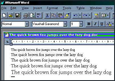
Hinted Sample
Straight away the text is more legible, uniform in weight and sharper on screen. Letter spacing is improved, curves are more even, alignment and diagonals are corrected, stem and serif widths regulated and troublesome bowls ('a', 'e') opened. Altogether much kinder on the eye and easier to read.
If you would like more information on the benefits of screen font legibility and TrueType hinting please email info@type.co.uk
|
 |
|
  

 | Guest |  |
 |
0 items |
 |
View |
|
| Total |
|
£ 0.00 |
|  |
| |
|
| 
Receive regular e-news bulletins packed with new releases and special offers!
|
|
|
Key benefits:
- shop without c/card
- monthly invoice
- purchase history
- backup resource
- premium content
|
|
| |
|  |
|  |
| |
|
| |
|
|
|
|
|
 |
|
|
|
|